Design challenge
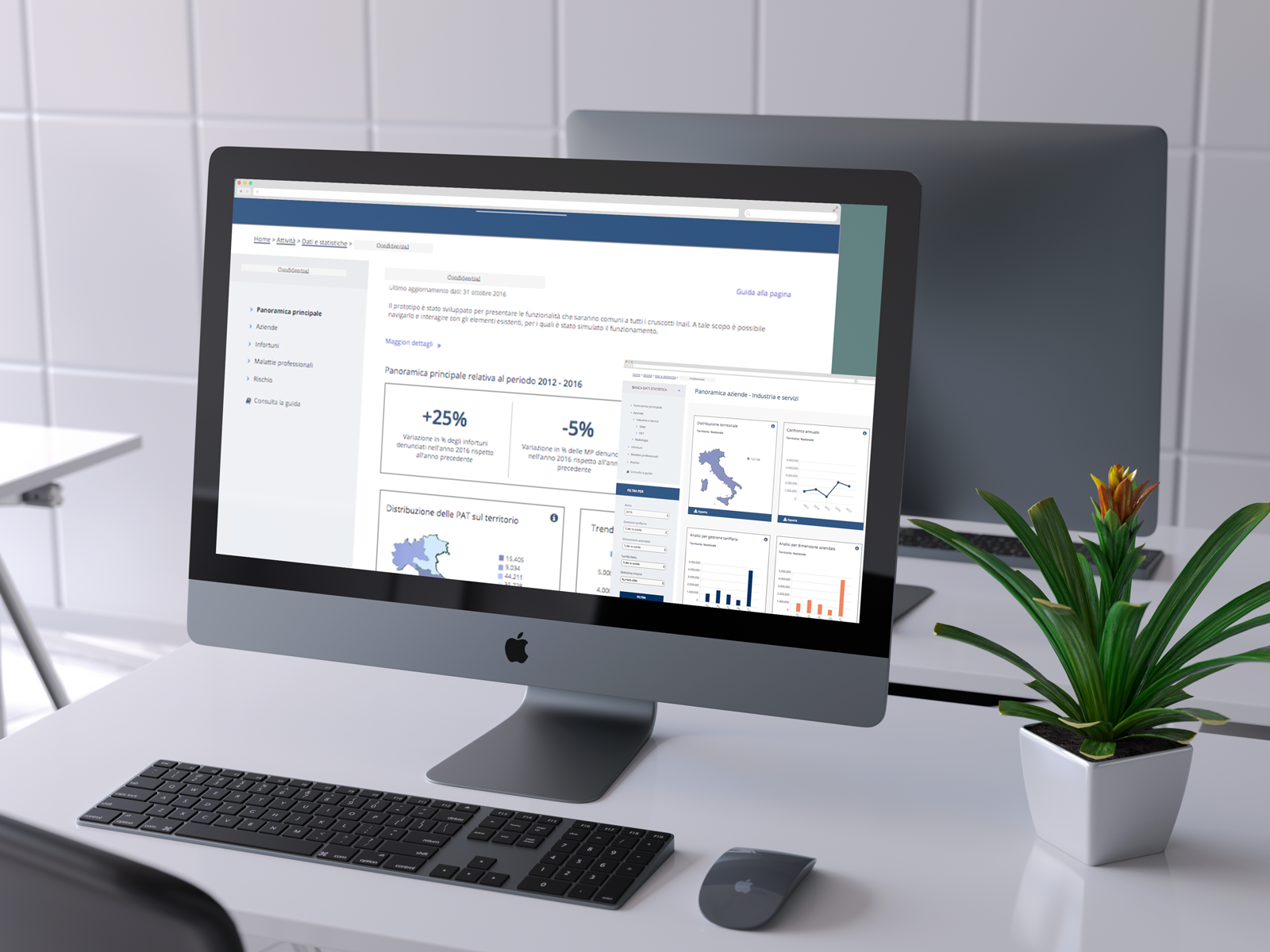
Design a post log in section of the client intranet aimed to help multidisciplinary team optimizing their online journey in editing medical records.
A BIT OF CONTEXT
This was two months UX research and design project for a Sopra Steria's client. The project is currently ongoing and held in Italy
Project Objectives
Client: National Institute for Insurance against Accidents at Work
Project Type: Conceptualization and design of MVP features of a post log-in section of the company Intranet aimed to support the multidisciplinary team in manage all the processes and activities for the reintegration to the work of the Patients.
Deliverables: Co- design outcome, Information Architecture, low fi prototype, Hi-Fi Axure prototype
Updated 2017
Story
Currently the multidisciplinary team carries out its activities on different systems and / or on excel.
UX Solutions
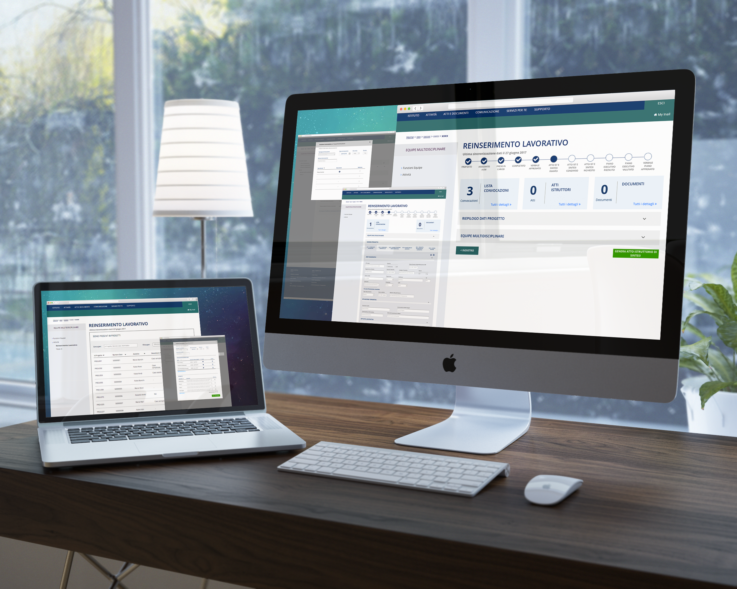
Redesign a frictionless flow that encourage doctors to complete their work tasks and added digital touch-points features in order to improve user experience:
Speed up practices by leveraging the interconnection with other systems that automates data entry tasks related to patients
Synchronize cross systems calendars to facilitate referral for medical visits
Introduce a progress bar to monitor project status.
OUR APPROACH
Week 1-2 : Discovery and definition. This included project plan, process analysis and user research to understand user segmentation, goals and behaviors;
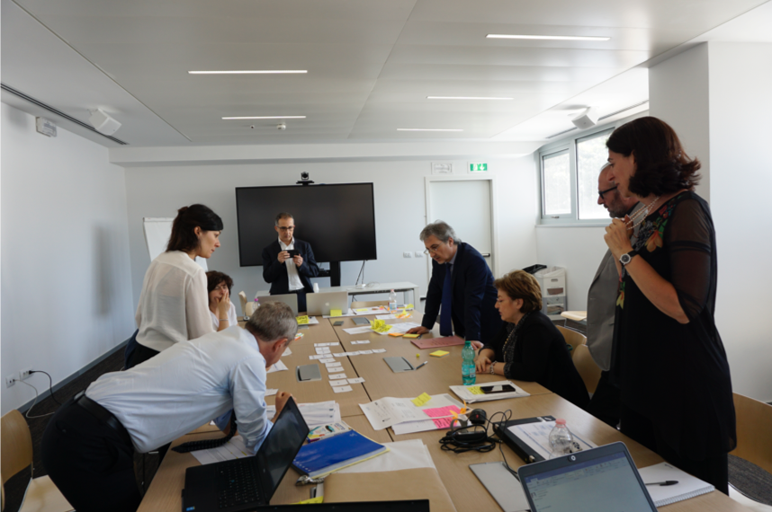
Week 3-5: Development This included several iteration of co-design sessions with stakeholders, paper prototypes, screen flow architecture and interviews.
Week 6-9 : Implementation and delivery This will include wireframes and prototypes to actualize current portal dedicated section, navigation and information architecture schema, usability tests on a final high-fidelity clickable prototype.
My ROLE
During these sprints, I was involved in the end-to-end design process.
Plan & Research
Activities planning
On the first research outcome and observing current systems we planned all the activities and created material in order to run several co-design sessions with the doctors. From the template to define Personas to the asset to design the low fi prototype.
Co-design
Co -Design
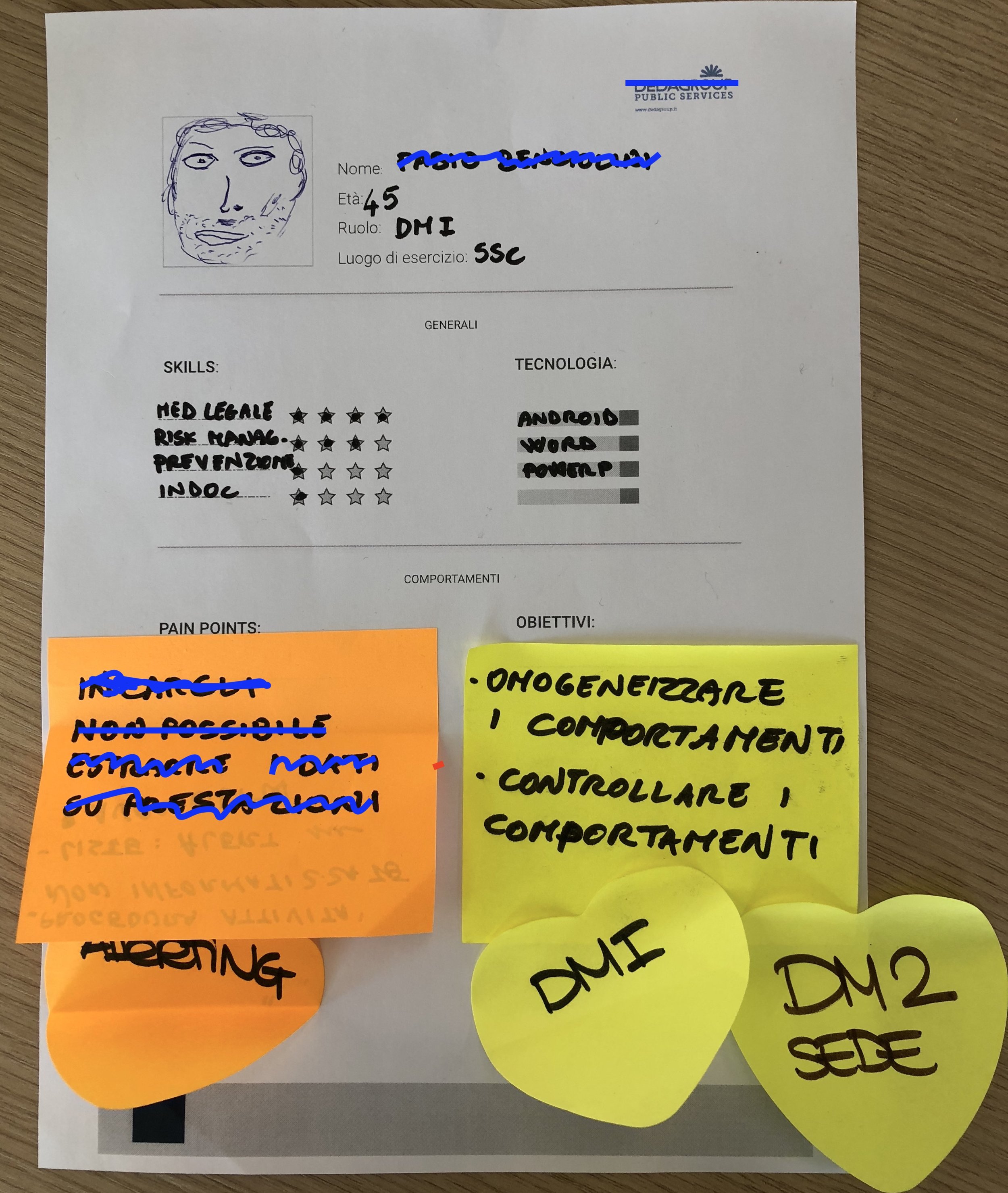
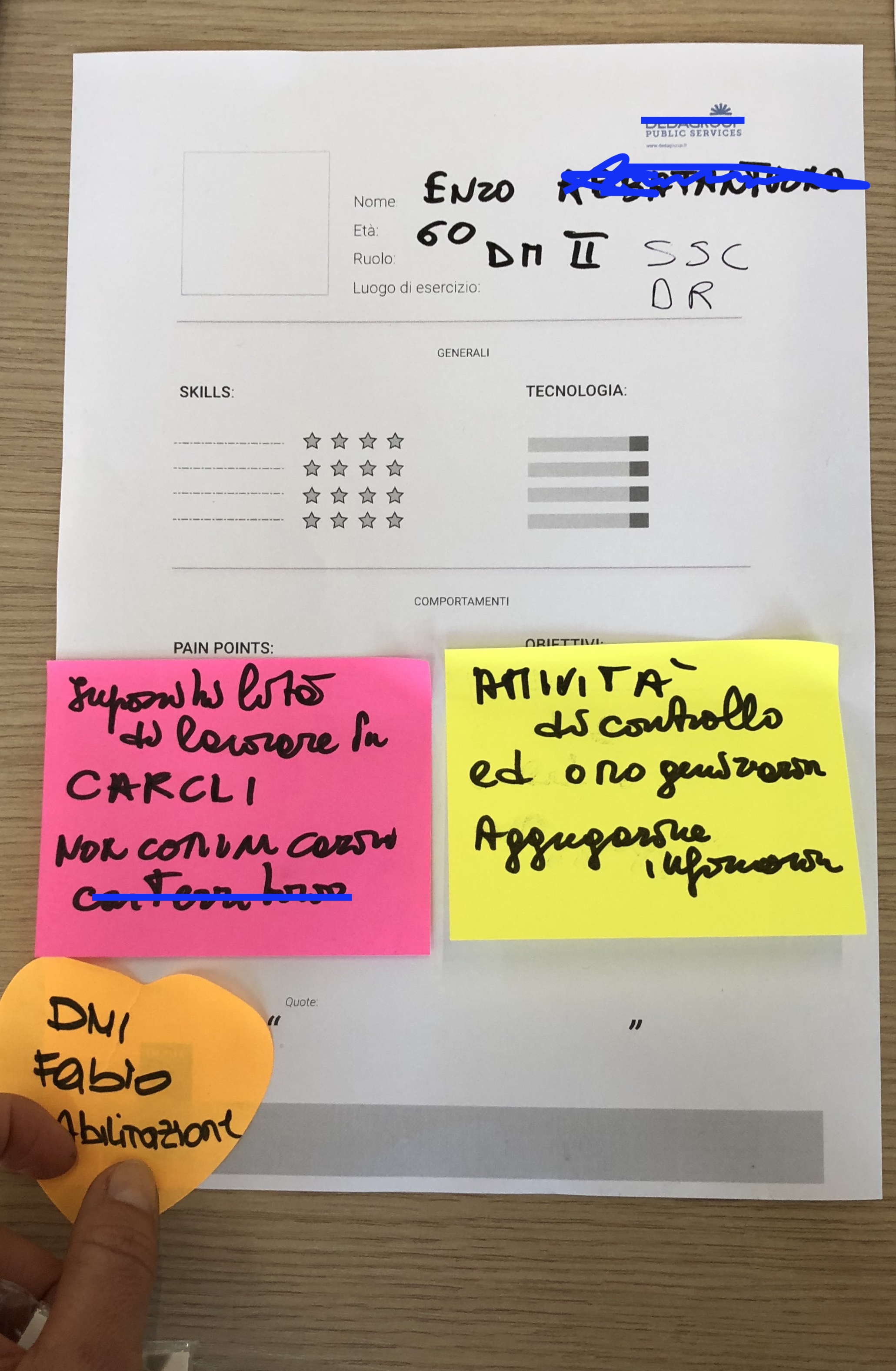
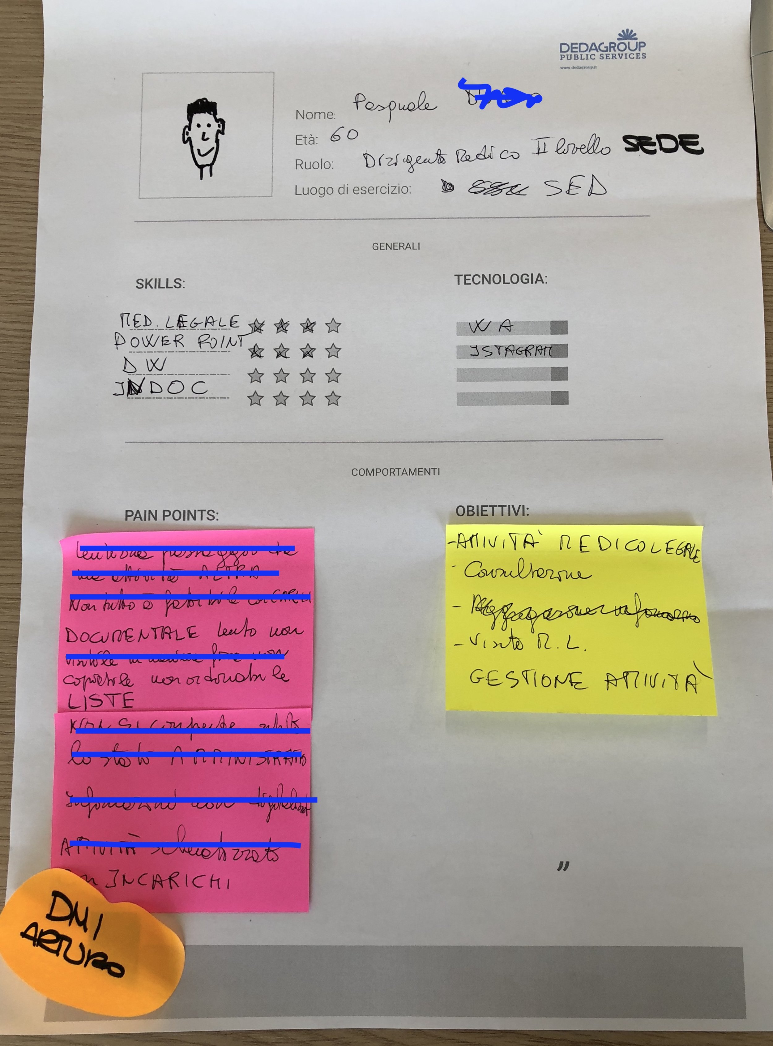
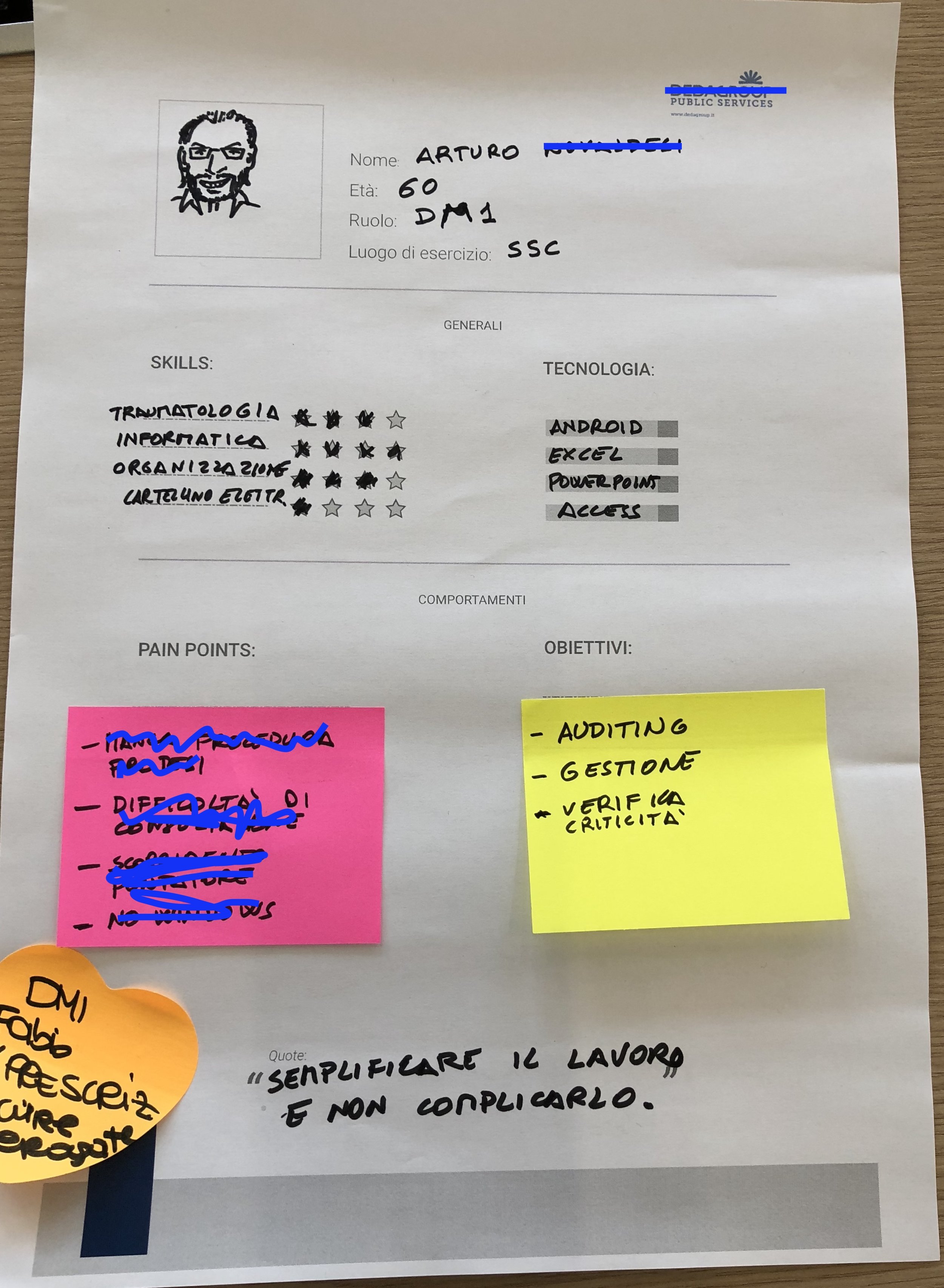
Personas
We designed together personas starting from doctor objective and frustration in using current medical records systems and tools
*Content has been hidden for confidential reason
INTERVIEWS
We interviewed all doctor that took part to the Co-design sessions. We conducted the interviews face to face with more than 15 doctors to refine their needs and frustrations.
Key take-aways:
Most of the doctors are not interested in adding technology that requires modifying the overall process, but the need to optimize the user experience of the current tool in a “Patient Centric” way.
”Streamline our process without introducing complex technologies ”
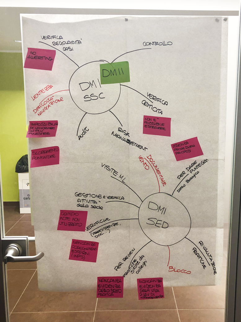
AFFINITY DIAGRAM & Card Sorting
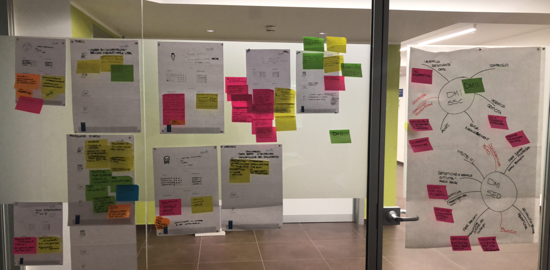
Together with the doctors we grouped the outcome from the interviews into different categories. That helped us to get a better understanding of our end users.
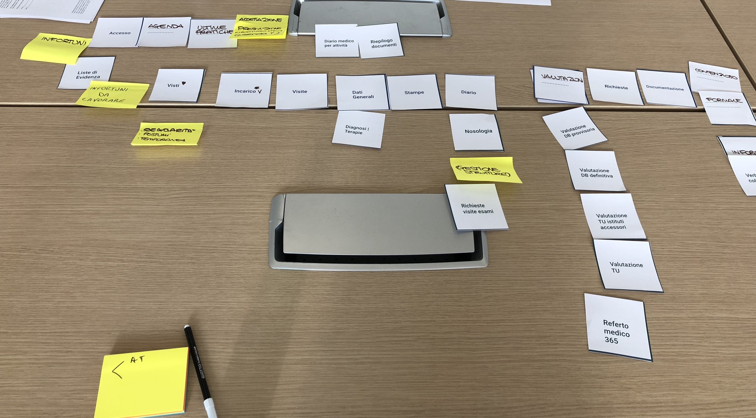
Trough a open card sorting test we were able to identify how to reorganize the information architecture:
Making the most used routes more accessible and eliminating disused ones.
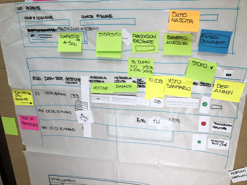
Paper Prototype
Key take-aways:
The brand new layout have been designed by the doctors them self. The design allows the doctor to get the most important information at a glance.
Prototype
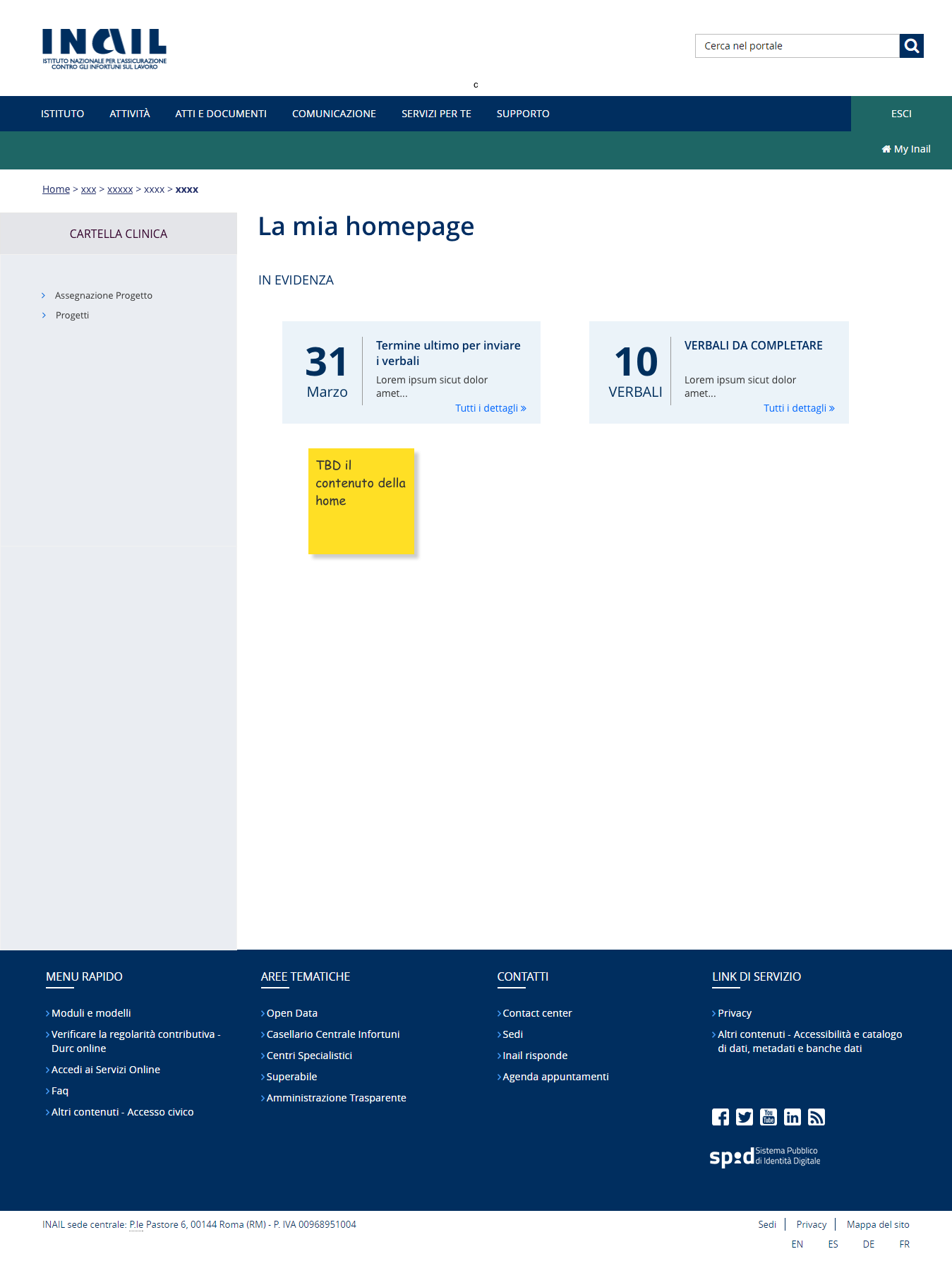
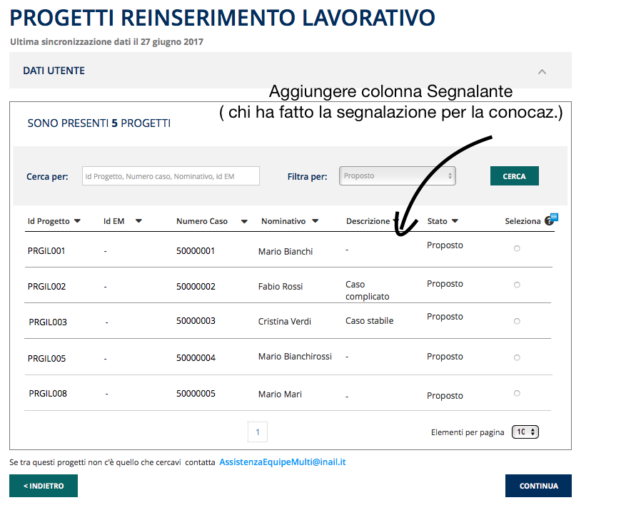
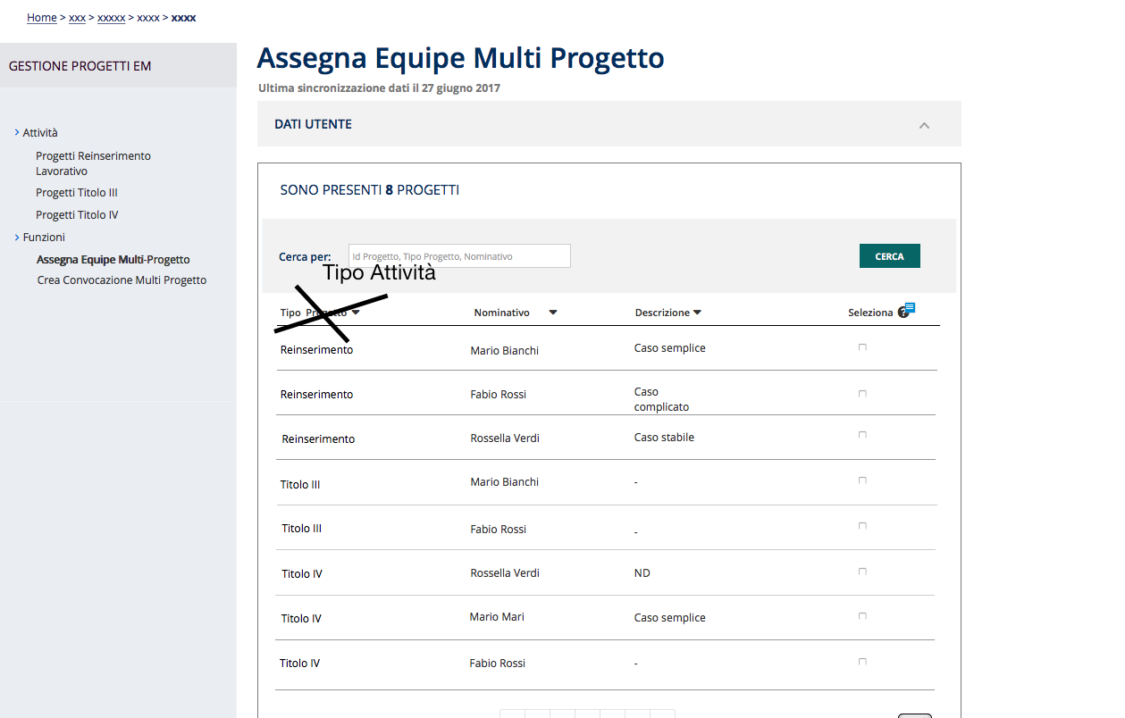
Axure Prototype
Key take-away: From previous Co-Design designed a solution that we validated then with doctors
USER TESTING
1.First iteration
We tested either interaction or process flow for the main process in tracking patients medical record.
Users: Doctors
Location: Company headquarter
Date: May 2018
Scope: Display preferences and device positioning
Key take-aways: Users refined some of the fields to have always on finger tips Patients crucial informations.

